Testing Mobile and Responsive Website Design
 As of January 2017, mobile website views are surpassing views on desktops and tablets. Mobile prioritization is more important than ever.
Device simulators are of two types.
Responsive Simulators show how your website adjusts dimensions to conform to different screen size
Mobile Simulators load mobile versions of a site, if available; these mobile versions are picked up by the phone browser. Actual mobile simulation (phone emulation) is more difficult than responsive simulation (screen resizing).
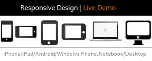
Mobile Simulators / Emulators
Google tools include the recently released Think with Google Mobile Test, and the older quick Mobile-Friendly Test. These load mobile versions if available.
Mobile Phone Emulator (please confirm) This site specifically also tests mobile phone appearance; it’s not as user friendly as the sites below, but it is more accurate, and it picks up mobile alternates (as opposed to those below, which simply scale the screen).
MobileMoxie Device Emulator (please confirm)
Mobile Emulators and Simulators – the Ultimate Guide – links to download tools for developers.
Responsive Simulators
Am I Responsive gives a quick overview ofthe four major design modes (responsive mode only)
Quirktool’s Screenfly – easy to use and versatile (responsive mode only).
Cybercrab’s Screencheck – nice selection of devices (responsive mode only)
Chrome Emulator – on the Chrome browser menu, select Tools > Developer Tools > select the phone/tablet icon at left of toolbar (responsive mode only).
iPad Peek – for iPads and iPhones (responsive mode only).
Responsinator.com tests mobile platforms only, including on iPhone, iPad, Android, and Kindle devices (scroll down to see the devices) (responsive mode only)
For Developers
Common modifications for mobile devices include:
- Menus are converted to a dropdown version
- Sidebars are hidden
- Menus are replaced by a dropdown version
- Sliders are reduced or eliminated
- Images are reduced
- Headers are replaced with mobile version
- Content that does not display on mobile versions is removed
Screen cutoff sizes (for development): General cutoffs for screen sizes are 320 px (mobile portrait), 480 px (mobile landscape), 768 px (tablet portrait), and 1024 px (tablet landscape) (reference 1, reference 2).
For Cross-Browser Testing, try
Links
How to Test Your WordPress Website for Responsive Design, from the Elegant Themes Blog


Leave a Reply
Want to join the discussion?Feel free to contribute!